Blocks in Many Colors
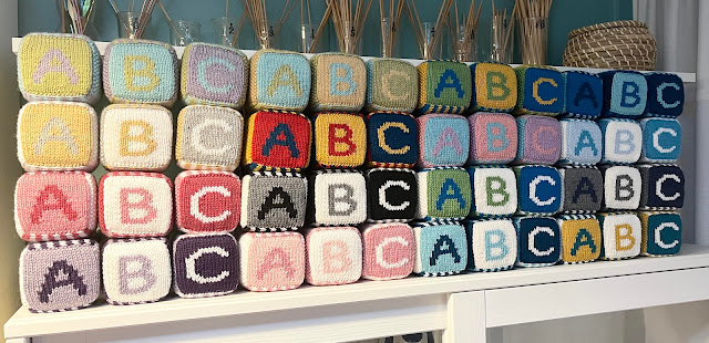
I may have gotten a little carried away trying out different color combinations for my Baby Blocks pattern. The color scheme I have in the pattern uses a medium and dark version of a main color along with white, but there are so many more options. Hopefully this can provide you with inspiration for your own version.
Examples of color schemes
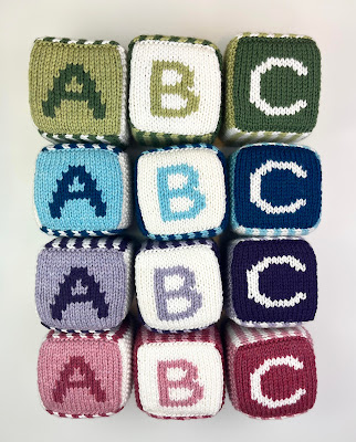
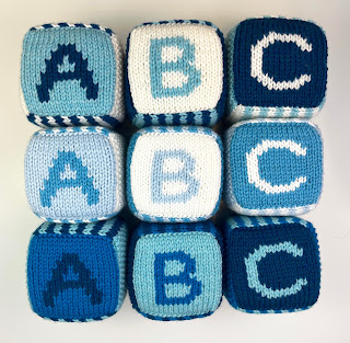
These blocks are variations on the colors in the pattern- white and a light and dark version of the same color.
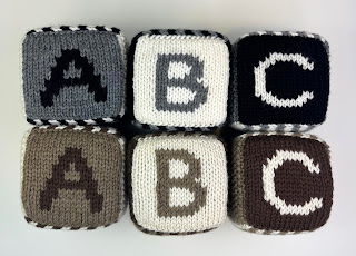
I also followed this pattern with neutrals.
Here is a lighter version of the color scheme in the pattern. Along with the white, I just used light and medium versions of the colors instead of medium and dark. I like this version. It's slightly toned down, but the letters and numbers are still easy to read.
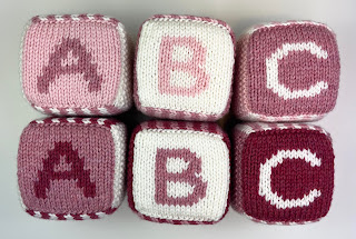
Here are the two pink versions.
And here are the blues. I tried a third version using light blue instead of white and a medium and dark blue as the other colors.
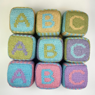
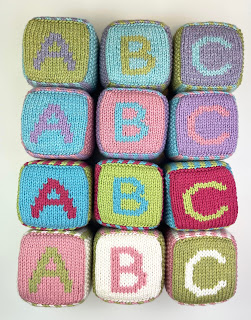
I tried more versions without white. These ones are different pastel shades. Using colors that are closer to the same value means the letters and numbers don't show up as boldly. More on this below.
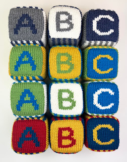
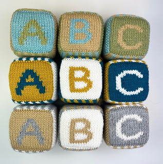
Here are more blocks that don't use white. Many of the letters show up better in these versions because there is a wide range in the values of the three colors.
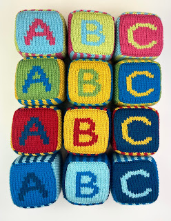
Here are some more color combinations that lean more towards the masculine side.
Here are some color combinations that are more feminine.
And here are some that are more gender neutral.
Tips for choosing colors
-Think about your recipient. Do they like brighter colors? Or do they prefer pastels? Would they like colors traditionally considered feminine or masculine or would they rather have something gender neutral? What colors would match their decor?
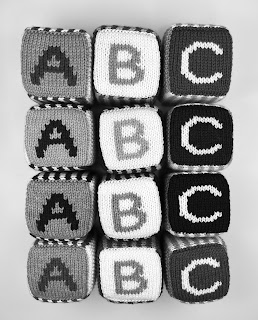
These two images show how the original color scheme in the pattern uses different values to create lots of contrast. The white is extremely light, then there is a medium value and a dark value version of the main color. The letters show up clearly and are easy to read.
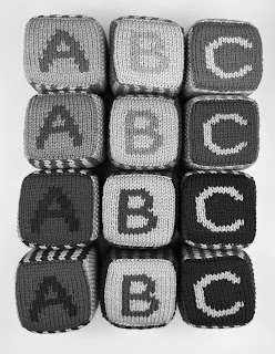
These photos show how using colors with similar values makes the letters harder to see. In the black and white version of the photo, they almost disappear. I still like this version of the blocks. The are more subtle and may be a better fit for someone who doesn't like bold or bright. Just keep in mind that the letters and numbers won't show up as clearly as with the different value colors.
It can be difficult to compare values without looking at a black and white version of them. Many of these colors look similarly bright in the color photo. None of them use white, but they all have a lighter value color, a medium value and a darker value. The letters are mostly pretty easy to read.
Have fun choosing your own colors!
If you'd rather purchase the finished product, I have added these blocks to my Etsy shop.






Comments
Post a Comment